Why Indeed?
The Plan.
Job hunting can be daunting, exhausting, and overwhelming. Initial excitement can quickly turn to anxiety; and in today’s climate, job seekers face more challenges than ever before.
Indeed is a job search app where users can
- Find job postings and apply with an uploaded resume.
- Receive job alerts and messages from potential employers.
- Post jobs and filter candidates (employers).
As a user myself, I experienced the benefits of Indeed from the POV of both employer and employee. However, there are clear opportunities to increase usability and better the user’s overall experience. By evaluating and re-designing the Indeed mobile app, user outcomes will improve and profitable growth will be nurtured.
Heuristics
Observing Neilsen Norman Group's usability heuristics, we narrowed our focus on the following based on a preliminary overview of the app.
- Visibility of system status
- Recognition rather than recall
- Aesthetic and minimal design
- User control and freedom
- Consistency and standards
- Help users recognize, diagnose, and recover from errors
The app was given a severity rating from 0-4 for each heuristic with 4 being a usability catastrophe.
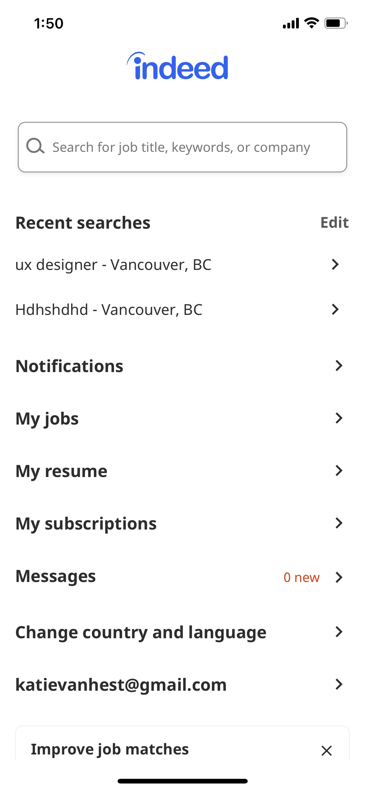
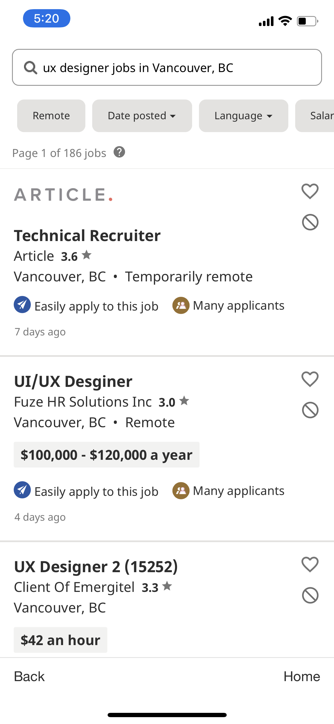
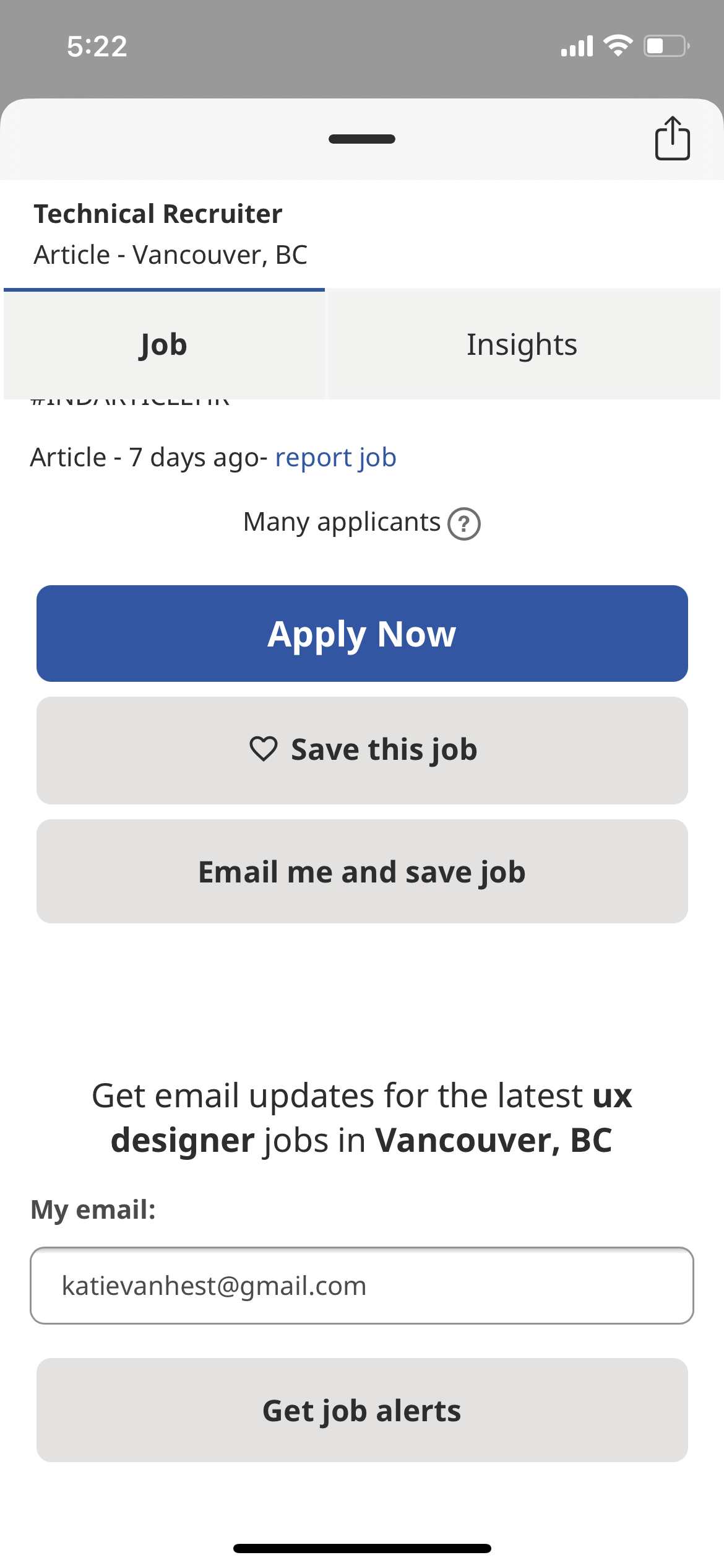
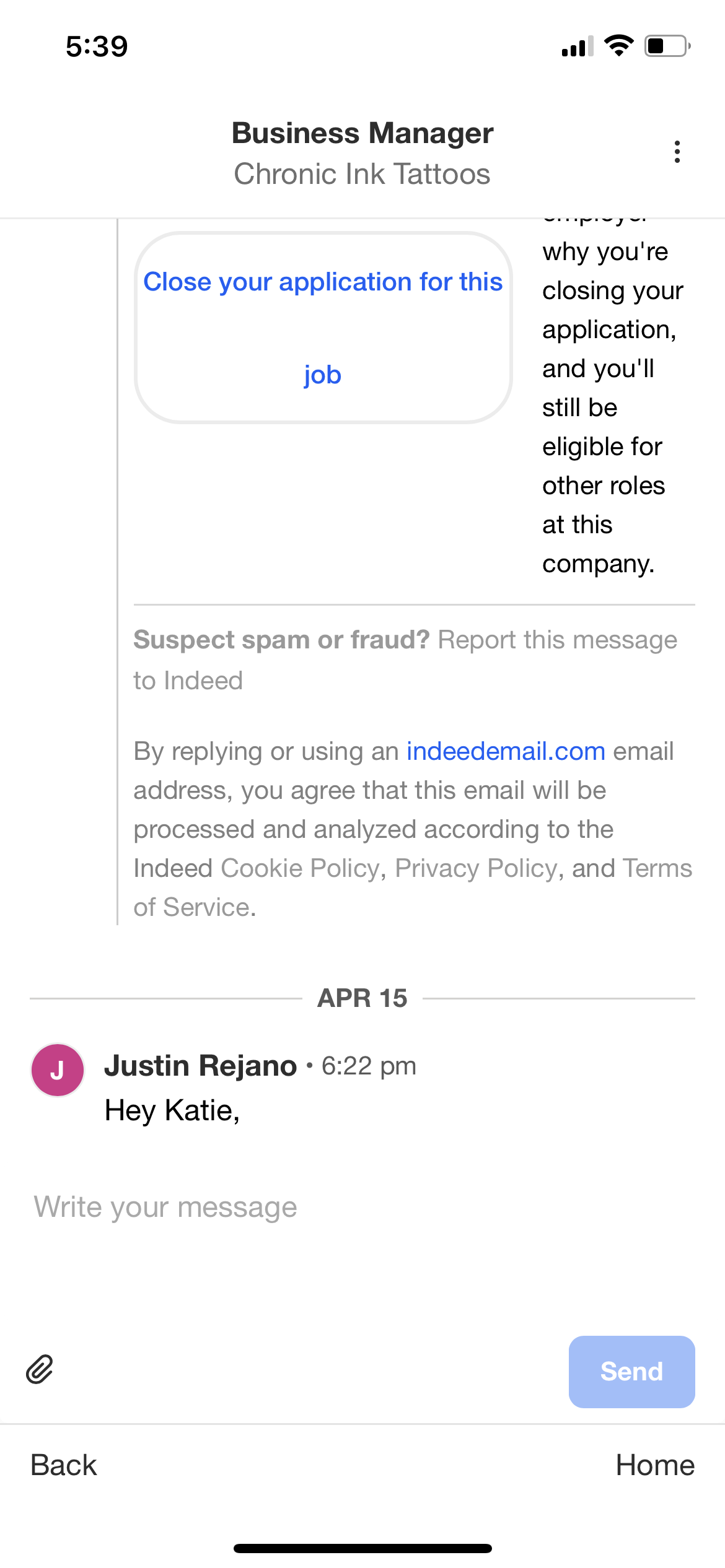
Original Screens
Evaluate.
Aesthetic and Minimal Design
Usability score: 3
- Home page is text-heavy and has no clear information hierarchy.
- Aesthetically the home page is drab and is lacking visual identity.
Consistency and Standards
Usability score: 3
- The home page doesn’t have a settings or menu icon; instead, all options within the app are listed vertically. This is an unconventional and dated system of organization.
- There are also no consistent Back or Home buttons in the app; each page has a different exit route.
User Control and Freedom
Usability score: 2
- Users can easily cancel the questionnaire pop-up, and they can undo the action of removing job postings from the Results page.
- However, there is no consistent exit strategy to navigate home throughout the app. Additionally, when a job posting is expanded users need to swipe down to exit; this isn’t intuitive.
Visibility of System Status
Usability score: 2
- There are some elements of feedback such as the heart filling in when you favourite a job posting, and suggested keywords when you begin typing in the search field.
- There are opportunities for improvement, however. The icon below the heart automatically removes the posting and its purpose is unclear.
Help Users Recognize, Diagnose, and Recover from Errors
Usability score: 1
- App gives suggestions on how to improve your search when there are no results, and shows error messages when forms are left blank.
- However, the language used in these messages comes off as robotic.
Recognition Rather than Recall
Usability score: 1
- One of the most attractive features of the app is that it pulls info from the user's resume to reduce repetition.
- However, some of the questionnaire questions are repetitive.
Design.
Introducing Haven.
The New Indeed
We focused our re-design on the heuristics 'Consistency and standards' and 'Aesthetic and minimal design'. Each were evaluated with a high severity rating of 3.
In this re-design there was an opportunity to create a feeling of encouragement and support from the app as this would alleviate some of the frustrations users feel when job searching.
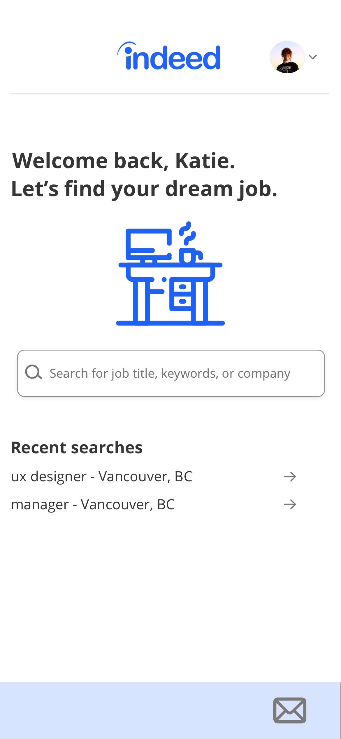

Home Page
We start at the home page. This is where we saw the most opportunity for improvement; and the decisions we made contribute to the two heuristics we narrowed our focus on. We reduced the text-heavy list to introduce negative space, and moved actions to a drop down menu to create information hierarchy.
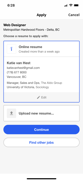
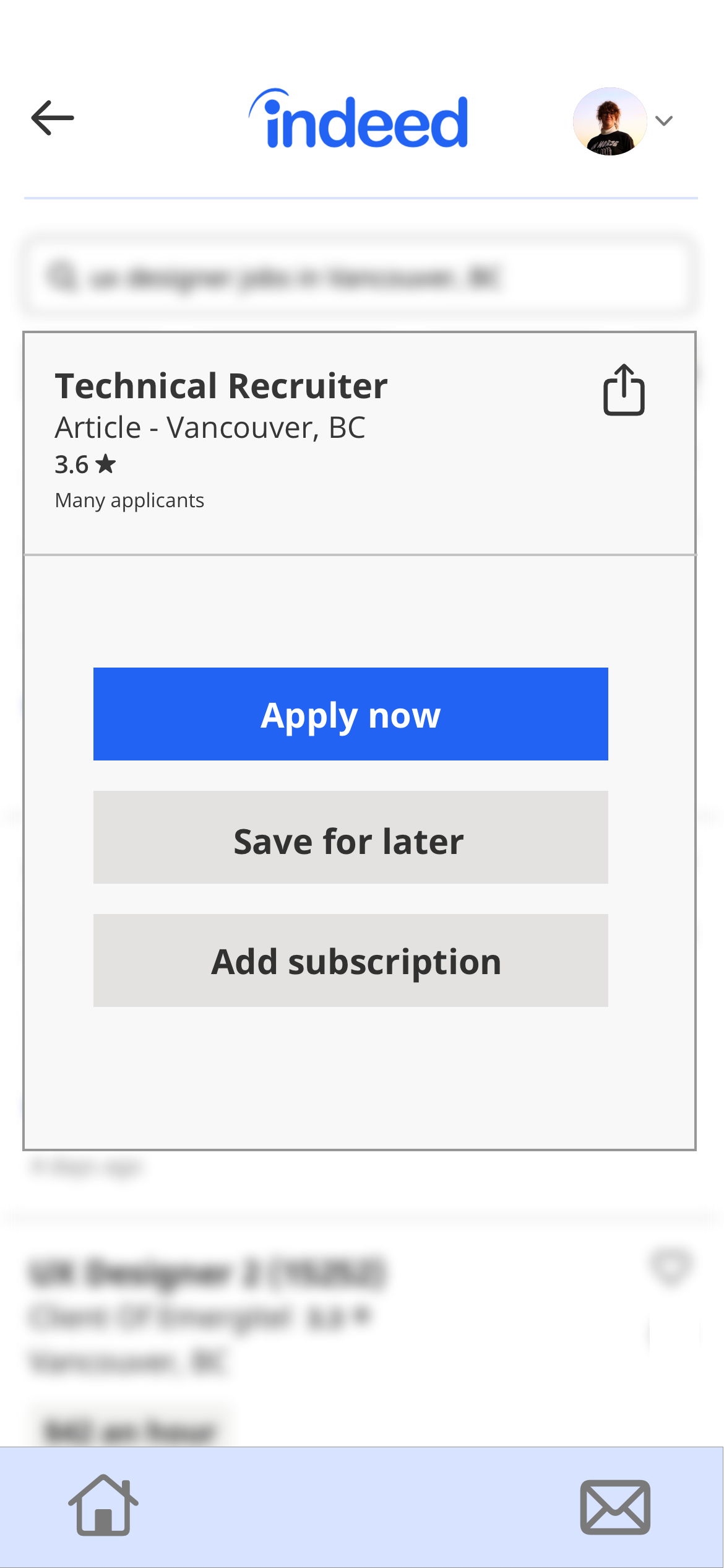
Apply Now
For the Apply Now section we created a modal with a blur background and simplified the content to improve information hierarchy. We incorporated a brighter, more inviting shade of blue in the 'Apply Now' button.
Submit Resume
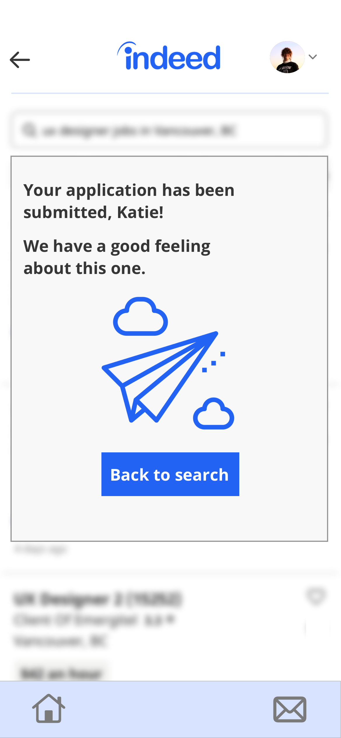
We converted this screen to a modal with a minimal design that included clear imagery, fewer actions, and encouraging language.
Messages
We removed irrelevant information and added a message icon and made a clear distinction between the reply section and the message from the employer.
Next Steps.
Reflections.
Value Proposition
Job searching can be a daunting task; now more than ever. Our proposed improvements will encourage and support Indeed’s users on their journey. This will in turn improve user outcomes.
Learning Outcomes
As a user of Indeed and someone who is transitioning careers, this was a deeply personal project for me. We are all struggling through this pandemic, and people who lost their job are uniquely affected. Using these heursitsics as a guide to creatively problem solve and improve usability was illuminating. Small changes can make a meaningful impact on someone's journey.