Haven is a safe space.
Empathize.
Haven is a mobile mental health companion aimed to improve patient outcomes, foster community, and reduce police intervention in crisis situations.
I knew going into my BrainStation program that social justice and health care were problem spaces I wanted to explore. What I found most attractive about UX Design was the opportunity to create meaningful solutions with significant impact.
Although this project was conducted using a human-centred approach, I disclaim as a white woman I will never truly understand the lived experiences of BIPOC and this is privilege.
Problem Space
Systemic racism in Canada is nothing new. The events of this past year however have shed a blinding light on the mistreatment and brutalization of BIPOC in Canada and elsewhere.
Oftentimes this occurs when police respond to mental health calls. Police are inadequately equipped to assist in these moments of crisis; and this can result in tragedy.
"Police in Ontario shot 62-year-old Ejaz Choudry in his home. In New Brunswick, they shot Chantel Moore in her home and Rodney Levi at a friend's barbecue. Prior to that, Regis Korchinski-Paquet fell from her balcony in Toronto while police were in her apartment. All four have died in the last six weeks; police called not because they committed crimes, but to check on their well-being".
-Thejaneg, 2020.
Design Question
Secondary research brought me to my goal for Haven:
How might we better connect BIPOC with mental health resources in order to minimize police intervention and improve patient outcomes?
Research Analysis
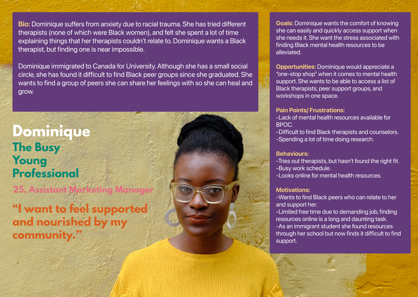
Participants were interviewed and strong themes emerged. All participants stated they would not feel comfortable calling 911 or police in a crisis, and find it difficult to find Black or Indigenous health care professionals and resources. Themes drawn from the interviews led me to the following insights:
There needs to be safe alternatives to emergency services for BIPOC.
Black and Indigenous health care professionals and resources need to be more accessible.
Support form BIPOC mentors and peers is beneficial to patients' mental health.
BIPOC need continuous and consistent care due to lasting effects of racial trauma.
Define.
User Persona
Ideate.
Design Intervention
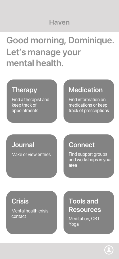
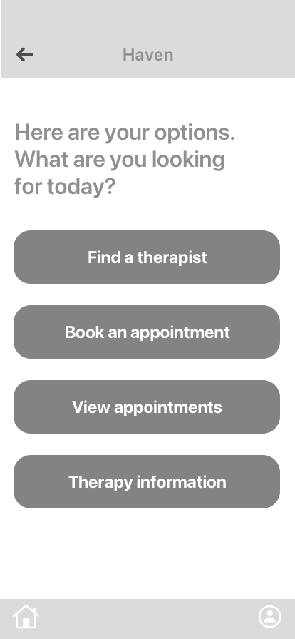
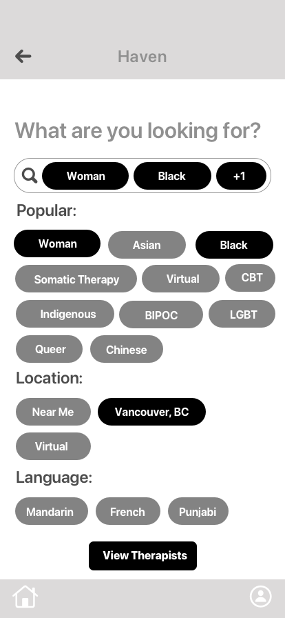
I came up with user tasks for Dominique based on my research insights, persona generation and experience mapping. I narrowed my focus to the epic of mental health tools, and decided to intervene by creating a digital solution that helps BIPOC in Canada find and book a consultation with a therapist.
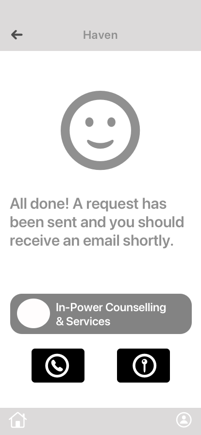
Wireframing & Prototyping
Iterate.
User Testing
Two rounds of user testing and iterations were conducted with the greyscale prototypes. This process was a massive reality check on the importance of not designing solely on intuition. Test participants found many of Haven's elements confusing and difficult to navigate.
Visual Identity
Approaching Haven's visual identity; I wanted to emulate happiness, comfort and community. I drew inspiration from bold and joyful images; which I injected into the UI.
Introducing Haven.
Hi-fi Prototype
After two rounds of iterations and introducing visual and brand identity, Haven was ready.
Next Steps.
Marketing Website
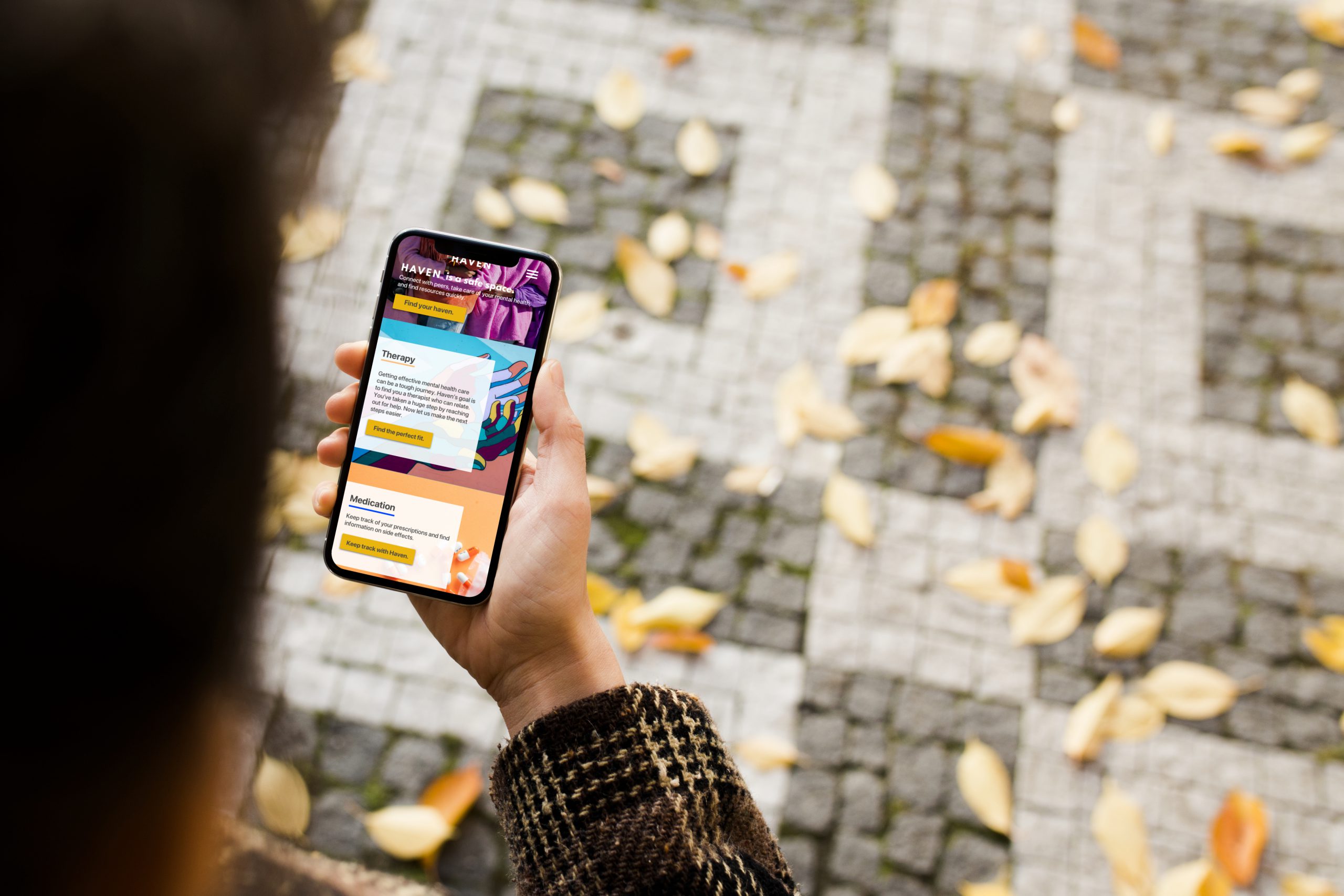
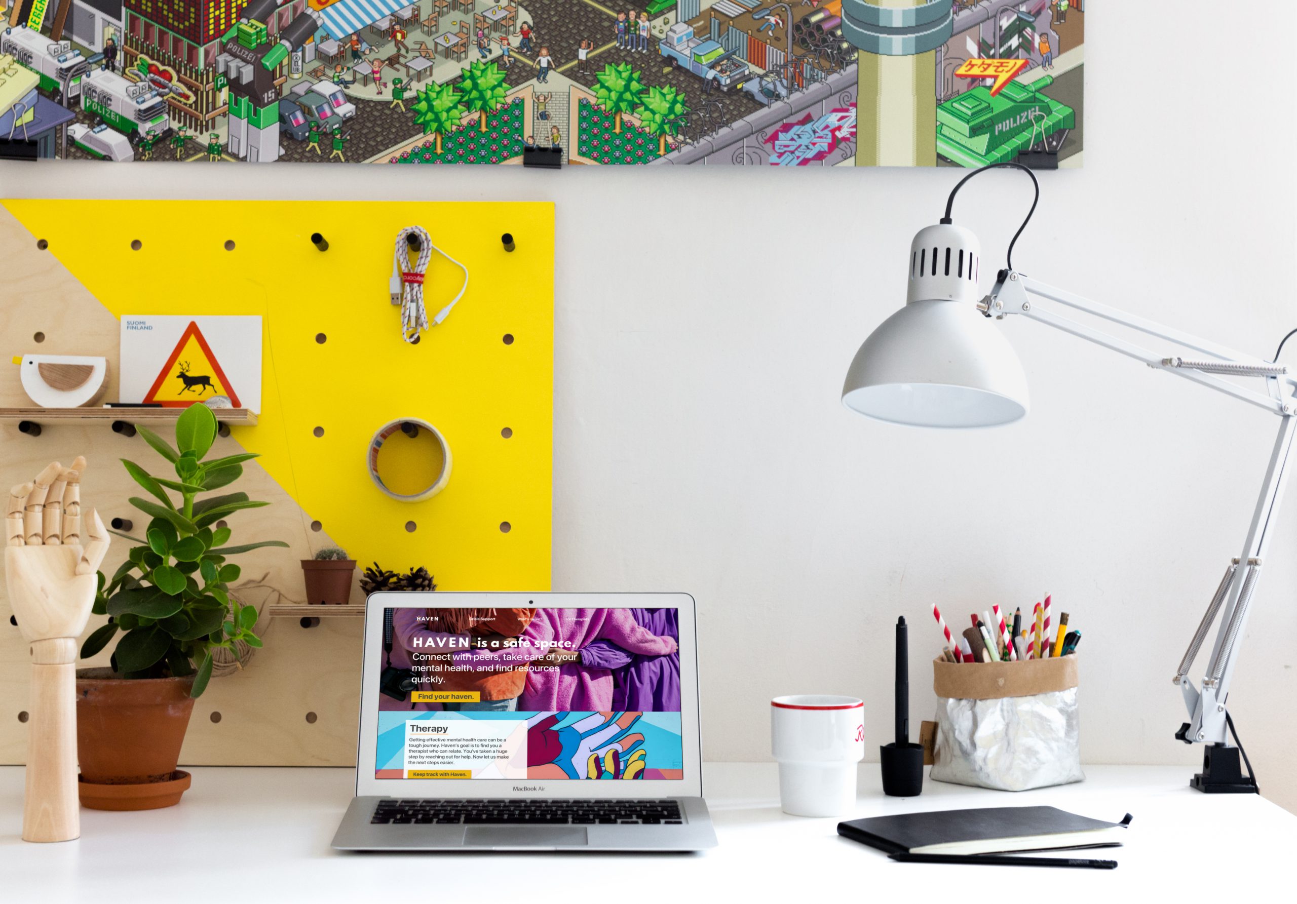
I designed a responsive website to support the project. I chose to boldly display the same images used in the app design to communicate Haven's brand identity.
Future Impact
Haven aims to help BIPOC struggling with mental illness find resources quickly and easily. My goal is to minimize police intervention by providing a space where users can access comprehensive care.
But I can't take my own word for it. I explored potential impact using the Tarot Cards of Tech. I examined Haven using the 'Scandal' card. My greatest fear for Haven is contributing to the very reason it exists; a mental health crisis ending in tragedy. By not correctly connecting users with the help they need I risk the outcome of police intervention.
I aim to mitigate this risk by ensuring Haven's resources reflect users needs and making crisis support within the app as accessible as possible.
Reflections
This project was challenging for me on many levels. Systemic racism is a hard truth and I grappled with the moral ambiguity of this project. As I learned more about anti-racism the lines blurred on whether this project was performative or genuine allyship. Am I virtue signalling? How can I empathize with the privilege I have?
What is clear is Black Lives Matter. It's my responsibility to listen and learn from BIPOC voices, consistently check my privilege, and work toward an anti-racist future.